
27·
4 days agostill looks better than the average Google search
still looks better than the average Google search
eh people are going to suffer through whatever the fuck they poop out the manufacturing and then buy a new one next year anyway so why bother
this image has two groups:
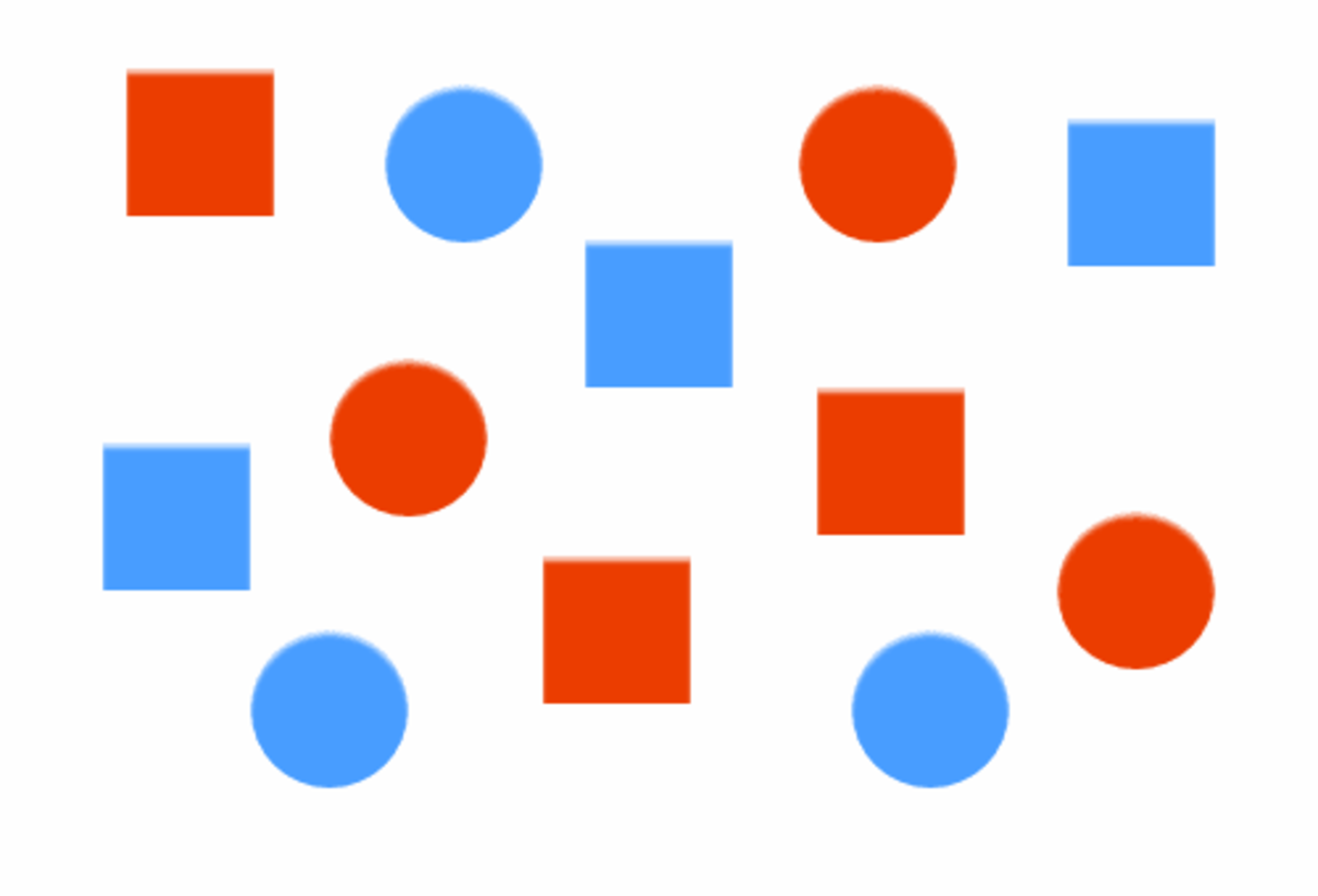
at first glance did you separate it into red v blue or circles vs squares?
you’re absolutely making things up. we’ve evolved to differentiate shades as well, which supercedes colors. even for colorblind people this kind of image should be differentiated by color or shade first.
not to mention not all people have perfect vision, in fact people with blurry vision probably outnumber colorblind people, and that would make the shapes not extremely reliable, especially when most icons would be more or less squares and circles with small details changed.
the squares are there for comedic effect. the shapes are not actually indistinguishable. but at a glance, color is a much faster tool we use to identify these icons. so the problem here is that it takes longer for us to decipher a Google app icon, and the solution would be to differentiate the colors.
also this would help colorblind people as well, because removing unnecessarily complicated colors would make the shapes easier to identify as well.
soulless corps trying to seem friendly, that’s why
i think they forgot to mention: they’re not all the same shape.
idk why you got downvoted i think this was a good iteration
it’s the other way around. you turn on auto backup and turn off specific folders. it doesn’t ask you to turn them on.

that was the plan for overwatch, but they massively fucked it up on several fronts. game’s still fun though imo
it is also a boat. just make sure it doesn’t come in contact with water or moisture
the question mark is a wildcard, so is asterisk. slashes are used in paths. characters you can’t use usually have implications for the OS. otherwise you can name your file pretty much anything.
they supposedly don’t have laces but they’re clearly laced with something. that’s the only explanation for these comments.
well they’re… i believe the scientific term is “hideous”.
i don’t think anything can. you’re too far gone!
the number of people openly admitting to wear Crocs in here is really concerning.


oh, she has thoughts.
she just knows sharing them isn’t in her best interest and this is working out better as it currently is.