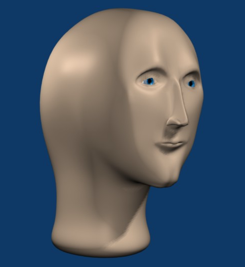
He’s not a robot though, right? I though replicants were genetically engineered humans?
- 0 Posts
- 12 Comments

 1·3 months ago
I don’t “want” my backhaul going over WiFi but I’m in a house where it is quite challenging to run Ethernet cable. It’s on the list to get to but it’s a big project. In the meantime I have a functioning network. People have different situations that call for different tools.

 121·5 months ago
Not sure if this is a joke. For years my phone was the only one paired with the Bluetooth on my wife’s car as I like to play music when I drive it but she couldn’t be bothered to mess with it and listens to the radio. That doesn’t mean that I am usually the driver in the car though as she usually drives it. It was paired for the few times she wasn’t in the car and I had to use it.
Deep Rock Galactic.
Rock and Stone, Miner!

 82·6 months ago
I’m sure your comments were as thoughtful as this dumbass meme.
making a big deal about it
Maybe I’m wrong but isn’t this sub for posting minor annoyances?
Same for me. I took multiple trips as a young adult where I just took scenery photos. Twenty years later I really regretted not including myself and family in those photos. Think of yourself in the future and skip sharing them online.

 41·7 months ago
I don’t think that’s true at all.
I realize the geometry predicts some optimal spot for viewing the curve but that just is a mathematical ideal not a real world necessity. If it was then everyone who has ever watched a flat screen would be like “omg I feel like I’m too close because I’m not watching from infinity.” I have a 35” monitor with 1800R and it is very pleasant in a normal desktop setting. I looked into 1000R screens since I like to sit fairly close and the curve felt so extreme that it was a major distraction no matter which distance I sat at.
I guess I’m saying that the curvature is very much a personal preference thing and if people can tolerate a flat screen they can also tolerate a curve that isn’t meeting some mathematical ideal.

 9·10 months ago
I have no evidence of this theory but I suspect that it is partly a result of careful manipulation.
Many buttons/menus in iOS utilize the blue color for text or backgrounds that also is used when you message another iOS device. The result is that it feels congruent and natural within the color scheme of the operating system - if you are messaging an Apple device.
The green color used for messages to non Apple devices is somewhat jarring in comparison and subtly (or subconsciously) gives you the impression that something is not right. Additionally the green that was chosen provides less contrast to the white text (relative to the darker blue & white). So reading the green bubbles is just a little more effort. These effects combine to a general sense of unpleasantness.
I believe all of this is deliberate on Apple’s part and isn’t as simple as someone “caring” about colors but rather the situation being engineered to make them care.

 4·1 year ago
We grew up in the south, right on the edge of the Midwest though. I remember one time my wife’s grandpa talking about how when he was a kid they all had ice skates because the ponds would freeze in the winter and the kids would skate. I was like that’s cool but the ponds don’t really freeze that solid in the winter.
Much later I had a moment of realization.
Their username makes this joke even funnier.

TIL, thanks for the explanation!