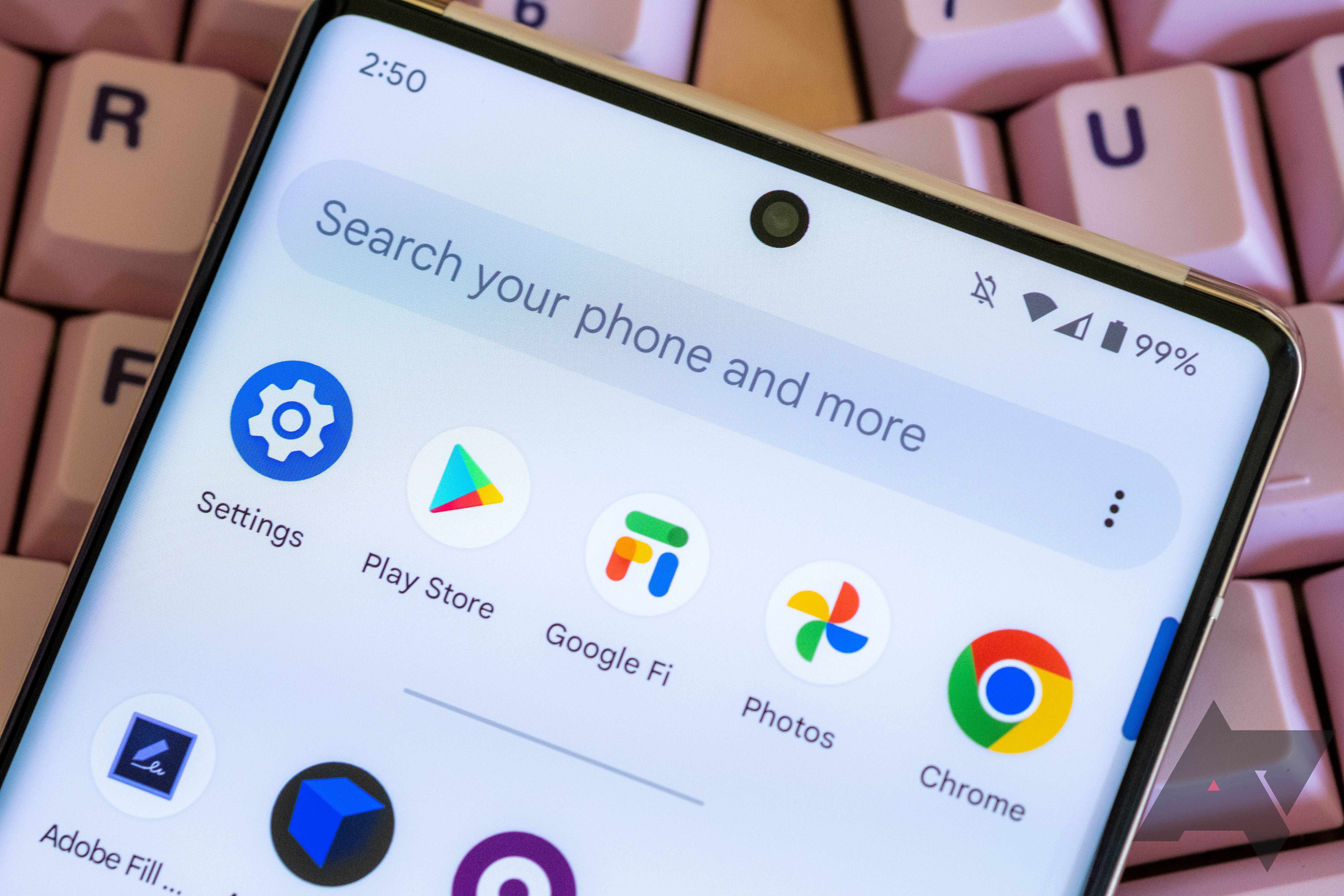
How has it taken them so long to realise that the bottom navigation UI means reachable UI elements?!
Apple hasn’t learned it. That’s the main reason I haven’t switched. That and no browser options or 3rd party app stores, can’t use 3rd party keyboard 100% of the time.
Looks like lot of things changed since last time you actually used an apple device. Apple has swipe down to search for a while now which doesn’t require reaching up. Safari has option to put url bar to top but default is bottom for more than a year now which is reachable. I personally never understood need for third party keyboard apps but that’s personal choice. 3rd party app store is valid suggestion but that seems to be coming in future update. but might be restricted only to EU. You could probably access it by setting iPhone region to some country in EU but that’s speculation.
I’m still waiting on putting my homescreen icons wherever I want and changing the grid size. Jailbroken iPhones are truly the best way to use those devices.
You look at android themes and every phone looks unique. Go on iOS setups and they’re almost all the same but arranged slightly differently.
Would be great if they could instead move the whole physical top of the screen closer to my thumb for the next Pixels.
This. I hate these super-long aspect ratios. Bring back 16:9 phones. My old Moto Z was 10x easier to type on than the last 2 pixels I’ve owned (a 4a and now a 7), both vertically (where the keyboard was wider) and in landscape (where more of the textbox was visible).
Or they could just let me drag it around and put it where I want it like other stuff in the home screen UI. That’s a thought.
Finally! Hopefully Samsung does the same thing in oneUI
We can already set a scroll down from the homepage to get a search bar. Would having a lower search bar on the app drawer be that more effective?
Yes because it’s a customization option and having more options is always better IMO
Fascinating…
And of course, Nova had this as a setting for years. Bummer.
Oh wow I’m so excited.


