You must log in or register to comment.
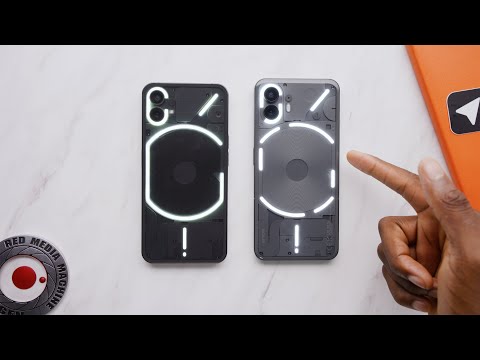
No one will convince me that this “Glyph Interface” is anything more than a total gimmick. Some of the gimmicks are impressive at least, this is just a bunch of white LEDs. Yeah, it does look kinda cool, but nothing more than that, focusing so much attention on such irrelevant detail of the phone is just weird.
You’re right. It was barely useful for me since I always have the phone face-up, to see who’s calling. Although I really like the stock Android experience on the Phone (1), it’s fast and smooth.
Yeah, it’s a gimmick, but it’s a gimmick in an overall solid phone and for me, it does have its use in being less distracting than the usual modes of notifications.


